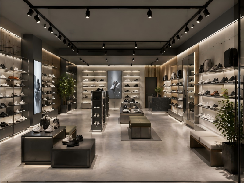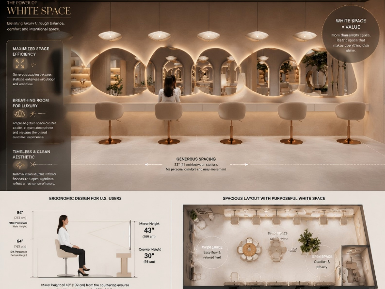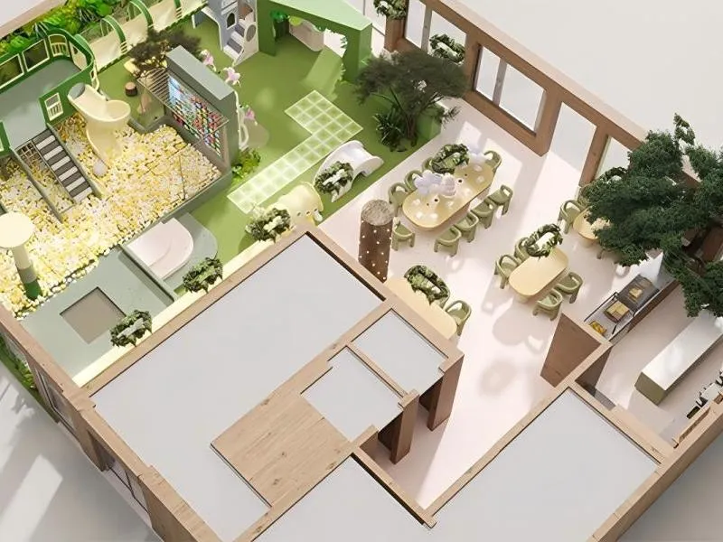
In 2026, cafés and F&B venues compete on more than coffee quality — they compete on atmosphere, identity, and shareability. A strong coffee shop design idea today borrows from gallery design: sculptural fixtures, bold materiality, and curated moments that make customers stay longer and return more often. This guide explores how indoor cafe design can use sculptural displays, lighting, and layout strategy to turn a café into a cultural landmark worth visiting and photographing.
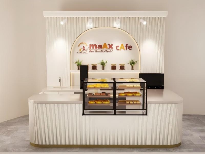
Three forces are reshaping what customers expect from a café visit in 2026:
| Force | Implication for Design |
|---|---|
| Social-first behavior | Every visit is a potential content creation moment — spaces that look generic never get posted |
| Premium positioning | Customers associate design quality with product quality — better space signals better coffee |
| Experience-led spending | People choose cafés partly for how being there feels — not just for the drink |
A gallery communicates something before a single word is read. It signals intention, curation, and confidence. When a café applies this logic — one strong focal point, deliberate material choices, controlled lighting — it creates the same effect: a first impression that immediately differentiates it from the café down the street.
The design principle is simple: one signature focal point that customers recognize and remember. Everything else serves that focal point rather than competing with it.
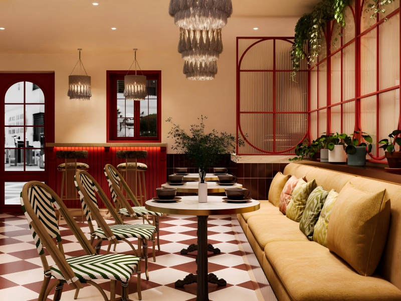
| Fixture Type | Design Role | Operational Function |
|---|---|---|
| Statement bar counter | Primary hero element — the most photographed surface in the space | Houses espresso equipment, workflow zones, and storage |
| Sculptural shelving | Secondary display element along queue or wall | Merchandises beans, cups, and seasonal products |
| Suspended feature rack | Ceiling-mounted visual element above the order zone | Displays featured products; reinforces brand geometry |
| Monolithic display plinth | Freestanding feature in the seating area | Product showcasing; seasonal install; brand storytelling |
The most common coffee shop design idea mistake is creating a visually impressive counter that does not work for the people behind it. Barista workflow — movement between grinder, espresso machine, and milk steamer — must be mapped before the counter form is decided.
Confirm equipment footprint and service clearance before finalizing counter dimensions
Design storage access (cups, coffee, cleaning supplies) into the sculptural form — not as an add-on
Edge profiles on all horizontal surfaces should be slightly raised or have a lip to contain spills
Heat resistance: surfaces near espresso equipment must tolerate steam and occasional direct heat
Stain resistance: sealed concrete, stone composite, and powder-coated metal all resist coffee and milk staining with routine care
Maintenance panels: design service access into the back of counter fixtures so plumbing and electrical connections can be reached without tool-intensive disassembly
A gallery visitor moves through a curated sequence of experiences. A well-designed café should do the same — each stage of the visit is intentionally designed, not left to chance.
| Journey Stage | Design Element | Intent |
|---|---|---|
| Entry reveal | Hero sculptural counter visible immediately from the door | Communicate brand identity in the first three seconds |
| Order queue | Queue path that passes the product display | Increases add-on consideration before reaching the counter |
| Pickup moment | Designated pickup zone with visual separation from the order queue | Reduces confusion; creates a satisfying "completion" moment |
| Seating discovery | Seating revealed progressively as customers move deeper into the space | Encourages exploration and longer dwell time |
| Exit and retail | Packaged products and merch positioned on the exit path | Captures impulse purchases on the way out |
Clear sightlines from the bar to the entrance allow staff to acknowledge arriving customers
Pickup zone must be operationally separated from the ordering zone to prevent congestion
Circulation pathways must maintain minimum ADA-compliant width even when the space feels full
Back-of-house access points should not cross the primary customer flow path

The surfaces in a café communicate quality before the coffee is poured. A space with rich, varied, matte textures reads as considered and premium. A space with uniform shiny surfaces reads as generic.
| Material | Visual Effect | F&B Durability |
|---|---|---|
| Concrete-look sealed composite | Industrial calm; urban gallery feel | Sealed surface resists staining; repairable |
| Powder-coated steel | Clean lines; color versatility; modern weight | Extremely durable; wipeable; scratch-resistant |
| Stone-like composite (honed finish) | Premium mass; permanence | Non-porous when sealed; heat-tolerant |
| Warm wood accent | Softens industrial materials; adds warmth | Treat with food-safe oil; avoid near high-moisture zones |
Before finalizing any surface material in a café environment:
Confirm heat resistance rating for surfaces adjacent to espresso equipment
Confirm spill and stain resistance — test with coffee and milk on a physical sample
Confirm scratch tolerance for horizontal work surfaces
Confirm antimicrobial or food-safe finish requirements for any surfaces in direct food contact zones
Specify matte over gloss wherever possible — matte surfaces show far less fingerprinting and water spotting in daily use
The single most cost-effective upgrade in any indoor cafe design is moving from one ceiling fixture type to a three-layer lighting approach.
| Layer | Function | Placement |
|---|---|---|
| Ambient | General room fill; warm base illumination | Recessed or indirect ceiling fixtures at 2700K–3000K |
| Task | Functional brightness at the work surface and pickup zone | Under-counter LED strips; focused downlights over bar |
| Accent | Highlights fixtures, product displays, and architectural features | Directional spots on sculptural elements; shelf lighting |
The accent layer is what creates gallery quality. A directional spot hitting the texture of a concrete counter or casting a shadow across a curved shelf surface makes the photograph. It makes the space feel designed rather than lit.
Place packaged coffee, cups, and seasonal merchandise along the natural queue path at eye height
Light display shelves from above or below with warm directional light — the same principle used in retail jewelry cases
Rotate one featured product or seasonal item in the hero display position every two to four weeks — gives regular customers something new to notice and discuss
Better product visibility on the queue path consistently increases add-on purchase rates. A customer who notices a beautifully displayed bag of beans while waiting to order is more likely to ask about it than a customer who sees the same bag in a poorly lit corner near the exit.
The best cafés in 2026 do not just serve drinks — they stage an experience. By treating the venue like a gallery and using sculptural fixtures to guide flow, elevate products, and create photograph-worthy moments, a coffee shop design idea becomes a true cultural landmark. With a well-executed indoor cafe design plan, artistic impact and daily operational efficiency are not in conflict — they reinforce each other.
Q1: What is the most important indoor cafe design element for a gallery concept?
A strong focal point — almost always the bar counter — supported by accent lighting that makes it feel intentional and iconic. Every other design decision should support that focal point rather than compete with it. One outstanding element executed well creates more impact than ten average elements spread across the space.
Q2: How do sculptural fixtures affect daily café operations?
When designed correctly — with barista workflow, storage access, and equipment footprint built into the form — they improve organization and flow. When designed without operational input, they can obstruct movement and slow service. Always map the operational sequence before finalizing any fixture form.
Q3: What materials work best for high-traffic café fixtures?
Sealed concrete-look composites, honed stone composites, powder-coated steel, and food-safe treated wood accents are the most common choices. The selection should be tested against heat resistance, spill and stain tolerance, scratch resistance, and daily cleaning requirements before specification is finalized.
Q4: How do I make a small café feel like a landmark space?
Invest in one hero sculptural element rather than distributing budget across multiple average fixtures. Keep the material palette to three or four choices maximum. Add directional accent lighting to the hero element. Design one or two specific viewpoints in the space that photograph well — a small space with a strong singular identity photographs better than a large space with no clear focal point.
Q5: How does display design increase retail add-on sales in a café?
Place packaged products — beans, branded cups, seasonal items — along the queue path at eye height, lit with warm directional light. Customers waiting to order are in a receptive mental state and will notice well-presented product that they might walk past completely if it were poorly positioned near the exit. Sculptural shelving that makes products feel curated rather than stocked converts browsers into buyers.